The New Shortcut Is a Starting Point, Not a Finished App
The new generation of AI coding tools can turn an image of a user interface into a first pass at HTML, CSS, React, or another front-end stack. That capability is useful for a designer who needs a prototype, a developer rebuilding a product they own, or a student practicing layout from a licensed mockup. It also tempts people to mistake “the screenshot looks similar” for “the app has been recreated.”
Those are not the same result. A screenshot contains pixels at one viewport and one moment. It does not reveal the layout rules, responsive breakpoints, data model, focus order, loading states, error handling, keyboard shortcuts, server behavior, accessibility tree, or permission to copy the design. AI can infer plausible code from the pixels, but plausible is not proof.
This guide builds a safe, repeatable workflow around one simple fictional product: PocketAtlas, a personal collection of places and notes. We will use an original screen brief and a small set of fictional records, create a desktop-and-phone-responsive web prototype, and describe how to evaluate a native-mobile path separately. The sample is intentionally generic: no copied logo, competitor text, proprietary assets, account flow, or private API.
The process works for a product you own, an open-source project whose license permits the work, a client design with written permission, or a mockup created for the exercise. It is not a guide to extracting code from a commercial binary, bypassing login or payment controls, impersonating a product, or reproducing a service without authorization. If your right to use a reference is unclear, do not feed it to an AI service. Start from a written brief and design original screens instead.
We will cover how to decide what is allowed, inspect screens as evidence, use the GitHub project screenshot-to-code as one possible generator, break a build into verifiable stages, adapt the result for different screens, test it, and document what the prototype does not do. You do not need that specific repository or a paid model to learn the method. Tools change; careful observation, small changes, and verification are the durable skills.
What “Reverse-Engineering the UI” Means Here
In this article, reverse-engineering means working backward from an authorized visual reference to an original implementation of its visible structure and interaction ideas. You observe the interface, write down what it appears to do, formulate a design specification, then build and test your own code. You are not recovering the original source code. In most cases, the original code cannot be derived from a screenshot; many different implementations can produce nearly identical pixels.
The distinction is important. A screenshot can suggest that a page has a header, a search field, and a list of cards. It cannot tell you whether the header is sticky, whether the cards come from a database, what happens if search returns no results, or whether a button has a keyboard-accessible name. Those are questions for additional observation, product requirements, and implementation decisions.
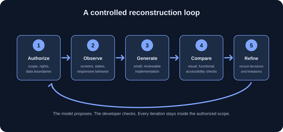
“AI mode” is best understood as a collaboration pattern rather than a magic switch. You provide authorized inputs and constraints; the model proposes a layout or code; you inspect the result; then you correct one specific mismatch at a time. If an agent can read files or run tools, give it only the permissions needed for the task. Keep changes reviewable, keep secrets out of prompts, and test every claim the generated code makes.
The purpose is not pixel worship. A faithful recreation may still be unusable at a different width, inaccessible to a keyboard user, or wrong about the product’s behavior. The goal is a legitimate prototype that communicates a design, supports its intended interactions, and makes its assumptions visible. If exact visual equivalence is not authorized—or is impossible because the source is incomplete—prioritize a clearly original, usable design over deceptive imitation.
Decide Whether You Are Allowed to Use the Reference
Before collecting a screenshot, identify who owns the product, the design, the text, and each visible asset, and identify what permission you have. “I can open this page” does not automatically mean “I can use this image to generate a commercial replica.” Permission can come from owning the app, a written client agreement, a compatible open-source license, an explicit design handoff, or another clear authorization. Save the permission and scope with the project.
For work, ask the product owner or legal contact whether screenshots may be processed by the particular AI service and model. A screenshot may include customer names, an internal roadmap, a company logo, unreleased features, or data from a real account. Using an AI service can send the image to another organization. A local generator may reduce external transmission, but it does not create permission to use material you do not own.
Use this quick gate before every capture:
- Reference rights: Do I own this interface, have written approval, or have a license that permits this use?
- Capture rights: Am I allowed to access the page and capture it in this way? Am I staying within ordinary, authorized access?
- Data rights: Does the image contain personal, customer, health, financial, employment, or confidential information?
- Tool rights: Does the AI provider’s current policy allow this data and workflow? Can the image be retained, reviewed, or used for model improvement?
- Output rights: Can I publish, deploy, or commercialize the new implementation and its assets?
- Identity: Could a viewer mistake the prototype for the original product or an official release?
If you cannot answer one of these, pause. Ask for written direction, use invented data, or switch to a clean-room brief that describes broad functional needs without copying distinctive expression. Avoid using the original name, logo, icon set, product copy, illustrations, or exact branded color system unless you have permission. Keep a record of what is authorized and what is expressly out of scope.
This is practical risk management, not legal advice. Copyright, trademark, contract, privacy, and interoperability laws differ by jurisdiction and facts. A commercial launch, a confusingly similar interface, a regulated product, or a disputed right deserves advice from a qualified professional before work proceeds.
Pick a Small, Safe Product to Rebuild
The best practice project is intentionally boring. Choose a small app that has a few screens, a clear purpose, and no real user account or sensitive data. PocketAtlas will let a person save places and short notes locally. The first version has a list screen, a place detail panel, a search field, an “add place” form, and a favorite toggle. Each saved place uses a fictional name and description.
Write a scope statement before writing code:
Build an original, responsive place-notes prototype called PocketAtlas. It is a local demo using invented sample records. On desktop, show a navigation rail, a list, and a detail panel. On narrow screens, show the list first and open details as a separate view. Support search, selection, favorite toggling, and adding a record in memory. Do not add authentication, a network service, maps, payments, location tracking, or third-party branding.
This paragraph provides the model a goal and a boundary. It also makes it easier to reject accidental scope growth. If a generated result adds a login form, a map API, analytics, or a new dependency, that is not “extra polish”; it is a change to review.
Keep the first milestone to one screen and one interaction. “Make a complete travel app” is not a testable request. “Render three fictional places in a list; selecting a row updates the detail panel; search filters the list; at 390 CSS pixels the detail panel becomes a separate route or view” is specific enough to implement and verify.
Write down a short “not in this version” list: no sync, no account creation, no imported contacts, no live map, no real geolocation, no public sharing, no offline guarantee, and no security claim. A prototype should not quietly imply features that do not exist. Clear scope protects you from model-generated complexity and helps anyone evaluating the result understand what it actually demonstrates.
Learn What a Screenshot Can and Cannot Tell You
A screenshot is a two-dimensional image. It gives evidence about visible geometry, hierarchy, typography, color, spacing, and content at a particular viewport. If you capture several authorized screens, it can also show visual differences between states. It cannot expose the DOM, component boundaries, CSS, data origin, hidden controls, responsive rules, or runtime errors.
Think of every inferred detail as one of three categories:
- Observed: visible directly in the authorized reference, such as a 24-pixel-looking gap or a selected row.
- Inferred: a plausible explanation, such as “the left column may be fixed width.”
- Decided: a deliberate implementation choice because the reference did not reveal the answer, such as a mobile navigation pattern.
Labeling these prevents guesses from turning into facts. If the reference shows three equal cards, you can observe three cards. You might infer a CSS grid. You can decide to implement them with CSS Grid, Flexbox, or components. Those are different statements.
For each screen, record the viewport dimensions, browser zoom, device pixel ratio if known, scroll position, and state. A screenshot at 1440 physical pixels could represent a 720 CSS-pixel viewport at a device pixel ratio of two. If you compare images without matching CSS viewport, browser zoom, font availability, and content, apparent differences can be misleading.
Create an observation sheet with one row per meaningful screen state:
| State | Entry action | Visible change | Persistent? | Unknown to verify |
|---|---|---|---|---|
| List loaded | Open the prototype | Three place rows appear | No | Whether records are remote |
| Place selected | Activate a row | Detail panel changes | No | What selection does on refresh |
| Search filtered | Type a query | Matching rows remain | No | Case and accent handling |
| Favorite toggled | Activate star | State indicator changes | Maybe | Whether it survives restart |
| Form invalid | Submit blank title | Error appears near field | No | Exact validation rules |
The “unknown” column is valuable. It tells you where the screenshot stopped being evidence. Do not ask the model to invent a hidden behavior and then describe its invention as fact. Decide a reasonable behavior for your own prototype and label it as a product decision.
Why This Workflow Is Trending—and Why It Still Needs Judgment
Image-capable models and AI coding agents have made UI prototyping accessible to people who are not professional front-end developers. A developer can show a layout rather than translate every pixel into a long verbal description. A designer can compare a generated draft with a mockup. A product team can explore a rough interaction quickly, then replace the prototype with production-quality code.
That speed changes where effort goes. The first draft can be cheap; evaluation, integration, and edge cases remain. The model may write a page that looks convincing while linking every button to #, using unlabeled icons, placing fixed pixel widths on a narrow screen, or storing data only in component state. Its output can be syntactically valid and semantically wrong.
Treat generated code as a proposal. You remain responsible for understanding the project, checking every diff, reviewing dependencies, and testing the behavior you plan to show. If a tool edits files, make a clean Git checkpoint first and limit its scope. If it can run shell commands, do not allow unreviewed commands to access secrets, delete files, install arbitrary packages, or deploy to a live account.
The same caution applies to “AI mode” products that promise autonomous implementation. A useful agent loop has a bounded task, known inputs, an observable result, and a human approval point. “Inspect src/components/PlaceList.tsx and propose a responsive list layout; do not edit files” is bounded. “Rebuild this whole commercial app and publish it” is neither.
The skill that compounds is not finding a perfect prompt. It is decomposing work: make one change, run it, compare the result, inspect the diff, preserve working behavior, and stop when the acceptance criteria pass. For more on this review loop, see our beginner’s guide to AI coding assistants.
Choose a Tool: The `screenshot-to-code` GitHub Project
One project to evaluate is abi/screenshot-to-code on GitHub. Its current README describes converting screenshots, mockups, Figma designs, and screen recordings into front-end code. It lists HTML with Tailwind or CSS, React with Tailwind, Vue with Tailwind, Bootstrap, and Ionic with Tailwind among its supported stacks. The README describes a React/Vite frontend and FastAPI backend for local use, and says a model-provider API key is required for local generation. Details may change, so read the README on the day you install it.
The project can be a fast way to obtain a draft, but it does not promise a complete mobile product. A generated React web view is not automatically a native iOS or Android application. A page that renders is not a finished application with tested state, secure data storage, push notifications, background tasks, a backend, or app-store compliance.
You have two broad ways to try it:
- Hosted service: less local setup, but your images and prompts may be processed by the service and its model providers. Review current privacy, retention, and usage terms before uploading anything. Use only an image you are allowed to share.
- Run the repository locally: more control over the environment, but you must install and secure its dependencies, configure a model provider key, and understand what the application sends to that provider. “Runs on my laptop” does not necessarily mean “all inference is local.”
Before choosing either, check the repository’s current license, recent changes, open issues, dependency health, and security posture. Read README.md, LICENSE, and any security or configuration notes from the actual checkout. Pin a reviewed commit or release for reproducibility rather than assuming that today’s main branch will behave the same tomorrow. Do not treat GitHub stars as a security audit or a guarantee of support.
You can complete every design and verification step in this article with another tool or by writing the prototype yourself. The method matters more than the generator.
Set Up a Disposable Project Before You Generate Code
Create a new folder for the prototype rather than pointing an agent at a work laptop’s important repository. Install a current supported Node.js release, Git, and the chosen framework’s prerequisites from their official documentation. For the web example, use a minimal React/Vite project or the starter recommended by your team. Avoid beginning with authentication, a database, an analytics SDK, or deployment credentials.
If you choose the GitHub tool, start from its current installation guide. At the time checked for this article, local setup involves a Python/FastAPI backend, a React/Vite frontend, package and Python environment setup, a browser runtime for preview, and one or more provider API keys. The repo README describes Poetry and Playwright for the backend and pnpm for the frontend. These requirements can change. Follow the current README, not a stale copied command list.
A safe local setup sequence looks like this:
- Create an empty workspace and record the tool version or Git commit.
- Read the repository documentation and license before installing anything.
- Use an isolated environment or container if your team supports one.
- Install dependencies using the repository’s documented lockfiles.
- Store provider secrets in a local environment file excluded by Git, or in an approved secret manager.
- Verify
git statusshows no secret file staged or tracked. - Start the frontend and backend using the documented development commands.
- Confirm the app loads on loopback/local access before exposing it to a network.
- Use one low-risk, fictional screenshot to validate the flow.
- Revoke or rotate a test key if it was exposed accidentally.
Never paste an API key into a source file, a prompt, a public issue, or a terminal transcript that will be shared. Do not commit .env, screenshots from private systems, generated source, or provider response logs unless the project owner explicitly approved them. A tool can display provider configuration in its UI, but still examine the network and storage behavior before using it with sensitive inputs.
Keep the generator separate from the app being built. A clean structure could be:
prototype/
  reference-notes/
    authorized-screen-inventory.md
  app/
    src/
  test/
  README.md
Only add screenshots when permission allows them, and avoid placing personal data in filenames or metadata. For a learning exercise, use a new mockup you drew yourself. That gives you clean provenance and makes later sharing much simpler.
Capture the Right Screens and States
If you are authorized to capture the reference, do not collect every screen you can reach. Select a small set that explains the workflow. For PocketAtlas, that might be: the loaded place list, a selected place, an empty search result, the add-place form, and a validation error. A single polished home screen can hide most of the work needed to make the prototype usable.
Capture each state with a known viewport and consistent browser settings. Use a clean account or synthetic dataset. Remove profile photos, names, email addresses, private messages, location history, access tokens, and customer records. Cropping is useful but inspect the final image: browser tabs, notification banners, user avatars, and status bars can disclose data too.
Use a naming scheme that explains state without embedding personal details:
01-place-list-desktop-1440.png
02-place-detail-desktop-1440.png
03-place-list-phone-390.png
04-add-place-validation-phone-390.png
The numbers describe sequence; names describe the state. Save a note with the CSS viewport, zoom, and the action that produced the state. If you cannot capture a screen at a phone width, do not assume the production app behaves the same there; use your own product decision and mark it as such.
If the screenshot includes text that is licensed or owned by someone else, consider replacing it with invented text before sending it to a model. For a visual prototype, content shape is often enough: “Place name,” “Neighborhood,” and a two-line sample description. Do not ask an AI tool to reproduce private or copyrighted copy just because it appears in a reference.
When motion matters, a screen recording may reveal a transition, menu, or sequence that still images miss. Capture only an authorized flow and keep it short. A recording can contain more personal data than a still image; review every frame and audio track before uploading. If recording is not permitted, write down the interaction you observed rather than trying to evade restrictions.
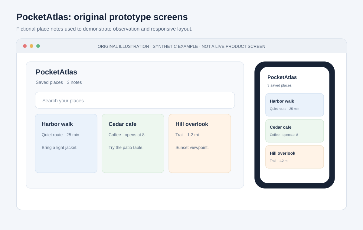
Original prototype mockup with fictional places; not a screenshot of a commercial app.
Build an Observation Sheet Before Prompting
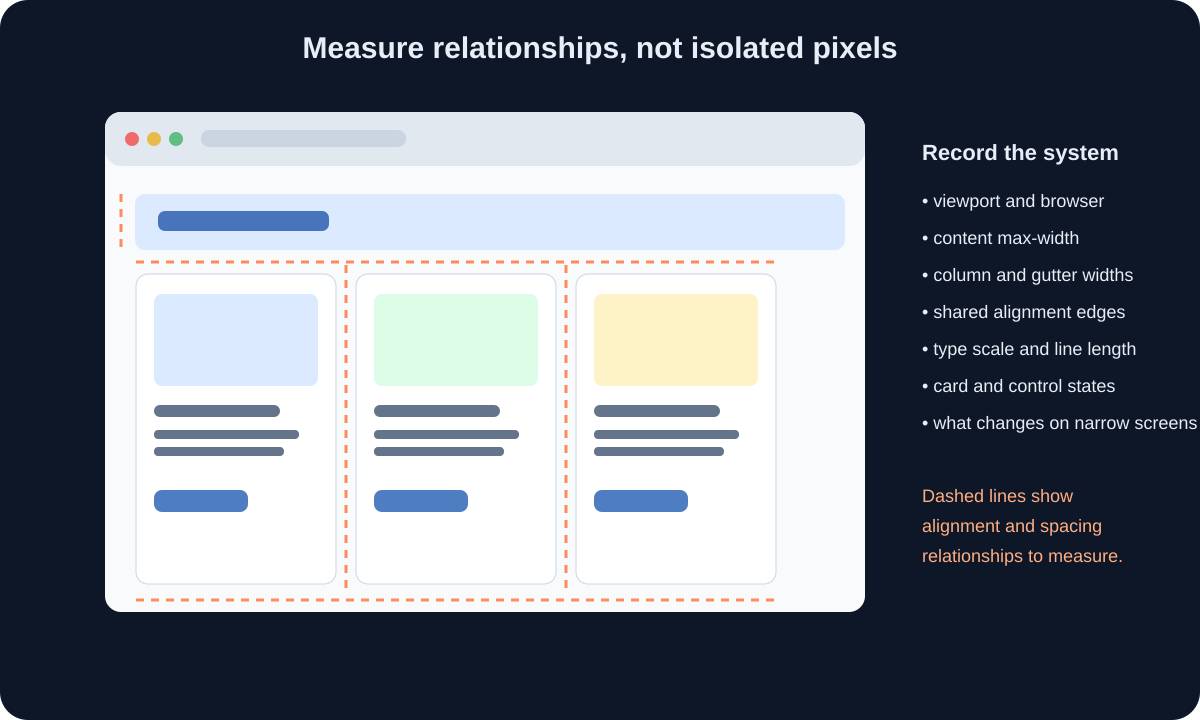
Do not rely on the model to measure the interface from pixels alone. Write down the visible rules that a front-end developer would need:
- Overall page background and the main content surface.
- Header height and the left, center, and right alignment points.
- Maximum content width and page gutters.
- Number and relative widths of columns.
- List row height and text hierarchy.
- Font family category, sizes, weights, line heights, and wrapping behavior.
- Color roles: background, surface, text, muted text, border, accent, destructive state.
- Spacing scale and recurring radii.
- Icons and whether they are decorative or interactive.
- Selected, hover, focus, disabled, loading, empty, and error states.
- At least one narrow viewport and how the layout changes there.
Use estimates rather than pretending to have exact measurements. A screenshot may have anti-aliasing and scaling that makes a one-pixel measurement unreliable. Note “about 16–20 CSS px” instead of falsely precise “17 px.” Then pick a consistent spacing token and test the visual result.
The diagram below is a worksheet, not a measurement of any commercial app. Dashed lines emphasize shared alignment edges and repeated gaps. You can make a comparable annotation for your own authorized screen with a drawing tool or a simple checklist.
Turn observations into a design token list before asking for code:
:root {
  --page: #f7f8fa;
  --surface: #ffffff;
  --text: #172033;
  --muted: #667085;
  --line: #d9dee8;
  --accent: #315f9f;
  --space-1: 0.25rem;
  --space-2: 0.5rem;
  --space-3: 0.75rem;
  --space-4: 1rem;
  --radius-card: 0.75rem;
}
These are original sample values, not a claim about another product’s design tokens. Centralizing them makes iteration easier: if the surface is too warm or the cards too round, change one variable rather than asking the model to rewrite every component.
Separate Visual Features from Product Behavior
For every visible control, describe what the user can do and what the interface should show next. A magnifying-glass icon is not a search feature by itself. A star is not a favorite system unless it can be toggled, announced, and persisted at the promised level.
Write a small behavior contract:
| Control | User action | Expected result | Failure / boundary |
|---|---|---|---|
| Search | Enter a place name | List filters without a page reload | No matches shows a clear empty state |
| Place row | Click, tap, or press Enter | The selected place details appear | Missing selection is handled |
| Favorite | Activate the labeled button | Favorite state toggles | State is visibly and accessibly announced |
| Add place | Submit a valid title | New record appears in the list | Blank title gets inline validation |
| Clear search | Activate clear control | Query resets and list returns | Focus stays predictable |
The model should not invent data policy. Decide whether the demo stores records in component state, local storage, a test database, or a server. For a disposable prototype, in-memory state is often enough. If you use browser storage, explain that clearing site data removes the sample. If you add a server, define authorization, validation, error handling, and retention before entering real information.
Build a state diagram for the main flow: list → selected detail → edit or favorite → saved result; list → add form → invalid or valid submission; search → results or empty state. A state diagram is a better prompt input than “make the app work” because it names the transitions and outcomes you can test.
If the product behavior is unknown in the reference, state your choice explicitly. “In this prototype, selection is not persisted after reload” is honest and testable. “This is how the original app works” is not justified unless you observed or documented that behavior.
Estimate the Layout from the Screenshot
Start with the frame, then the major regions, then the fine detail. At desktop, measure the viewport and estimate the content container. If a 1440-pixel viewport leaves about 120 pixels on each side, the content may be around 1200 pixels wide; treat that as a first estimate, not source truth. Check whether the columns align with the header and footer. Shared alignment often matters more visually than matching every icon.
For a three-column layout, write the relationship rather than hardcoding a screenshot’s exact widths: “navigation is compact and stable; list is medium-width; detail gets the remaining space; columns can shrink only to their minimum readable widths.” In CSS, that may become grid-template-columns: 15rem minmax(18rem, 24rem) minmax(0, 1fr). The values are a design starting point that you validate at several viewports.
Use browser developer tools to inspect your own generated layout at exact CSS dimensions. Compare the original and result side by side at the same scale. Look first for major differences: container width, column count, top offsets, line wrapping, card density, and contrast. Only then tune small details.
Do not build the whole design from absolute positioning. It may match one screenshot and collapse when text changes. Use Grid or Flexbox for relationships, intrinsic sizing for content, and fixed dimensions only where the design truly requires them. Set min-width: 0 on flex or grid children when long content should wrap instead of forcing overflow.
Also record where the visual reference has uncertainty: font unavailable, image cropped, viewport unknown, or device scale unknown. Substituting an available font may change line breaks and vertical rhythm. That is a design choice; call it out and test it rather than repeatedly prompting the model to “make it exact.”
Use the GitHub Generator in Small, Reviewable Steps
Once you have a clean local workspace and authorized inputs, use the current README of screenshot-to-code to choose hosted or local setup. The README has changed over time and may change again. For local installation, follow its current backend, frontend, environment-variable, browser-preview, and model-provider instructions. For a hosted service, check current data processing and image-retention terms first.
Start with one screenshot and one task. A first prompt can be:
This screenshot is an original mockup that I own and am authorized to use. Build only the visual structure for the PocketAtlas place-list screen in React and CSS. Use the fictional names and sample text below, not text from any other product. Implement a responsive page using semantic HTML. Do not add authentication, API calls, analytics, maps, external assets, or packages. Keep components small and explain the files you create. Do not claim the behavior is complete.
Ask for a proposal before file edits if the tool supports it. Review its proposed component tree, stack, and dependencies. If it introduces a UI framework, icon package, state library, or CSS reset, ask why; add a dependency only when it solves a concrete requirement. A generated project can otherwise expand from a visual proof into an unreviewed supply-chain change.
Then request one incremental change at a time:
- Render the static frame with sample data.
- Match the broad spacing, colors, and type hierarchy.
- Add a single selection interaction.
- Add search and its empty state.
- Add the form and its validation.
- Add responsive reflow.
- Add keyboard and accessible-name checks.
- Run visual and functional tests.
After each step, inspect the diff, run the app, and preserve the last known-good state in Git. If the generator has a visual preview, treat it as a convenient comparison—not as proof that all browsers or screen readers behave correctly. Ask for a concise list of files changed and assumptions made so that review is possible.
Generate a Desktop Skeleton First
The first generated view should be static. For PocketAtlas, define the core DOM in terms of meaning:
<main className="app-shell">
  <nav aria-label="Main navigation">{/* owned product navigation */}</nav>
  <section aria-labelledby="places-heading">
    <h1 id="places-heading">Saved places</h1>
    <label htmlFor="place-search">Search places</label>
    <input id="place-search" type="search" />
    <ul>{/* fictional place rows */}</ul>
  </section>
  <section aria-labelledby="detail-heading">
    <h2 id="detail-heading">Place details</h2>
    {/* selected record or an instructional empty state */}
  </section>
</main>
This sample omits implementation details intentionally. A real component should use data-driven rendering, stable keys, controlled inputs where needed, clear empty states, and no placeholder elements that mislead users. Ask the model to explain why each landmark exists and which controls are interactive.
Use accessible native elements where they match the behavior. A clickable <div> is not a good substitute for a button. A link navigates; a button performs an action. A text input needs a visible label or a valid accessible name. If the model uses generic clickable containers, ask it to replace them with semantic controls and explain keyboard behavior.
Use CSS variables for colors, spacing, and radii. Use real text content with similar lengths to the intended sample because text length changes wrapping and card height. Use an original simple shape or a licensed asset if a thumbnail is needed; do not hotlink the other product’s CDN or copy its logos.
At this stage, do not implement a server or persistent accounts. Render three fictional records from a local constant and inspect the page at the reference’s authorized desktop width. Fix the large blocks first. Then capture a screenshot of your own build and compare it against the design brief. A clear skeleton gives the model fewer opportunities to hide a layout bug under decorative polish.

The photo is illustrative and is not a screenshot of the generator or PocketAtlas. Source: Wikimedia Commons, CC0 1.0.
Turn the Skeleton into a Maintainable App
After the static view matches the broad structure, ask the generator to split it into small components that reflect repeated responsibilities. For example: AppShell, PlaceList, PlaceRow, PlaceDetail, SearchField, and AddPlaceForm. A good component boundary makes an interaction easier to test or a layout easier to adjust. Do not create a component for every div merely to make the file look modular.
Keep fictional data separate from presentation:
const initialPlaces = [
  { id: "p-1", name: "Harbor Walk", area: "North Shore", favorite: true },
  { id: "p-2", name: "Cedar Garden", area: "Old Quarter", favorite: false },
  { id: "p-3", name: "Market Steps", area: "Central", favorite: false },
];
These are invented sample values. The stable IDs are distinct from display names so renaming a place does not change its identity. In React, use the stable ID as a list key; do not use the array index when items can be filtered, added, or reordered.
For the prototype, keep the state model explicit: places, selectedPlaceId, searchQuery, and form state. Derive the visible list from the query instead of maintaining two competing lists. Derive the selected place from the ID instead of duplicating the whole selected record in state. This reduces inconsistent updates.
Ask the AI to explain state changes and edge cases. What happens if a selected place is removed? What is selected after search hides the current place? Does adding a place select it, clear the form, or preserve the draft after validation fails? Decide answers before coding.
Run the linter or type checker if the project has one. Review all imports and package changes. Check the browser console for warnings and errors. Ensure sample content is not accidentally sent to an API. A simple prototype should remain simple; resist a generated suggestion to add a global store or backend until your acceptance criteria actually need it.
Make the Layout Adapt to Mobile, Not Shrink Into It
Responsive design is not a desktop screenshot scaled down. On a narrow screen, the same content may need a different order, navigation pattern, or interaction. PocketAtlas can show the place list first and open the detail as a separate route or full-screen panel. A cramped three-column desktop layout with tiny text would technically fit only by making the mobile experience worse.
Use CSS breakpoints as consequences of content pressure. The included width diagram gives illustrative ranges for testing; it is not a universal list of phone and tablet sizes. A layout should change when its columns can no longer hold readable content, not merely because a device is called a tablet.
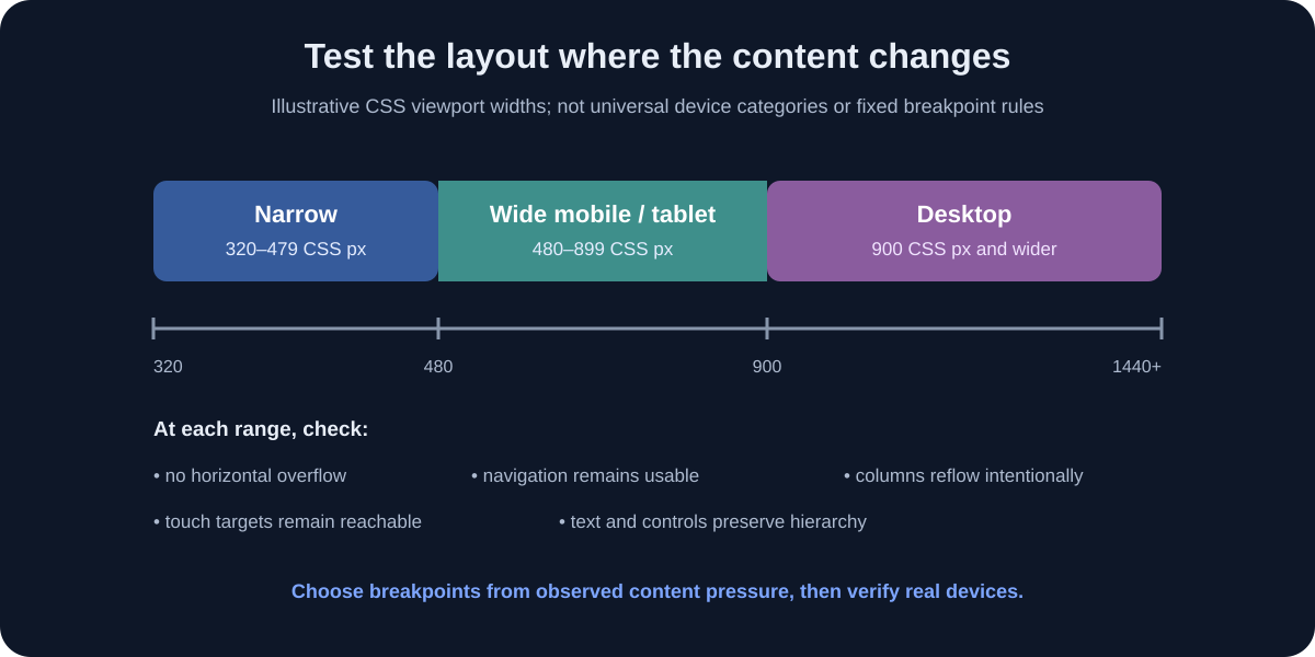
For the example, a CSS Grid layout might begin with desktop columns and switch when the list and details no longer have usable widths:
.app-shell {
  display: grid;
  grid-template-columns: 14rem minmax(18rem, 24rem) minmax(0, 1fr);
  min-height: 100vh;
}

@media (max-width: 56rem) {
  .app-shell {
    grid-template-columns: 4.5rem minmax(0, 1fr);
  }

  .place-detail {
    grid-column: 2;
  }
}

@media (max-width: 38rem) {
  .app-shell {
    display: block;
  }

  .desktop-navigation,
  .place-detail:not([data-open="true"]) {
    display: none;
  }
}
Treat the numbers and selectors as illustrative starting points, not a complete app. A production implementation should use a documented responsive state model and test what hidden panels mean for screen-reader and keyboard users. If a panel is visually hidden, ensure it is not still focusable. If a menu opens, manage focus and provide a clear close action.
Use fluid widths, minmax(), clamp(), and content-driven heights where appropriate. Avoid fixed heights around text that may wrap, and avoid hiding important content simply to resemble a narrow screenshot. Add horizontal scrolling only for content that truly requires it, such as a data table with a clear accessible alternative—not as a patch for a broken layout.
Test at 320, 360, 390, 768, 1024, and 1440 CSS pixels as a useful starter set, then test actual target devices. Check portrait and landscape where relevant. Zoom to 200% and increase text size if the target platform allows it. Ensure buttons remain tappable and controls do not sit under notches, browser bars, or the on-screen keyboard.
Define Desktop and Mobile Navigation Intentionally
Desktop can show a persistent navigation rail and selected details side by side. A phone may need a single-column list, a dedicated detail route, and a back button. Decide whether selecting a record changes the URL, changes local view state, or opens a dialog. The screenshot cannot make this choice for you.
If a phone detail view is a separate route, browser back should return to the prior list state when that is the behavior you intend. Preserve search and scroll position where useful. If details open in a dialog, trap focus appropriately, label the dialog, close it on an intentional action, and return focus to the opener. Avoid improvising modal behavior with a visually styled div.
If desktop uses a collapsible sidebar, provide a named button with aria-expanded and aria-controls. If mobile uses a bottom navigation bar, account for safe-area insets and do not let it cover the last list item. If navigation is icon-only, provide accessible names and a visible current-page state.
Test navigation without a mouse. Tab through the interface, activate buttons with Enter or Space as appropriate, and verify that focus does not disappear when a view changes. Test a screen reader if the product needs it; semantic HTML is the foundation, not a guarantee of an accessible experience.
AI-generated code often copies the shape of a menu but misses the interaction contract. Require the model to report: how the menu opens, how it closes, what element receives focus, what aria state changes, and what happens on narrow screens. Then verify the behavior in the browser rather than trusting the explanation.
Implement the Interactions as Explicit State Transitions
For each interaction, write a before-and-after description and then implement the smallest state transition. Search changes the visible rows. Selecting a row changes the selected ID. Favorite toggling changes one boolean for one record. Submitting the form either produces a validation message or appends a normalized new record. These are easy to test because each action has a visible result.
Use controlled form inputs when validation and submission need to reflect current values. Validate input in the app even if HTML attributes such as required are also present. Normalize whitespace where appropriate, show a field-level error, and preserve the user’s text after a failed submit. Do not show a success message if no save actually occurred.
For favorite buttons, use a <button type="button"> with a label that communicates the action and current state, such as “Add Harbor Walk to favorites” or “Remove Harbor Walk from favorites.” An icon alone is not enough. Avoid a generic toggle that only changes color; the state should remain understandable in high contrast and when read aloud.
Search behavior needs decisions too. Does it match case-insensitively? Does it search the area as well as the name? What appears when there are no matches? Does a clear control appear only when the query is nonempty? Is the result count announced politely without interrupting typing? For a small local list, a simple string comparison is fine; do not add a search service unless needed.
After implementing a transition, test normal and boundary inputs: blank, whitespace-only, long names, punctuation, duplicate names, no results, keyboard activation, and repeated toggles. If the app has an asynchronous action, test loading, success, timeout, and failure. If it has no network, do not invent a fake spinner that implies a server request.
This is where screenshots stop being enough. A static reference can guide appearance, but functional correctness comes from an explicit interaction contract and repeatable tests.
Choose a Data and Persistence Boundary
For the exercise, an in-memory array is a safe first milestone. It resets when the page reloads, which is acceptable if the prototype says so. If you later add localStorage, store only the sample records, handle malformed stored data, and make the reset behavior clear. Do not store passwords, access tokens, sensitive notes, or real personal information in browser storage.
If a real product needs persistence, define the data flow before asking AI to generate it:
form input
  → client validation for usability
  → authenticated request
  → server-side authorization and validation
  → database transaction
  → explicit success or error response
  → UI updates from confirmed result
Client-side validation is not a security boundary. The server must enforce permissions and validate all input independently. Do not expose private API keys in a browser bundle. Do not use an administrative service key from React. If the prototype uses a real API, work with approved test credentials and nonproduction data.
Consider failure states deliberately: no connection, slow connection, expired session, validation error, permission denied, duplicate submission, and partial save. Show a meaningful message and a recovery action. Never display “Saved” before the server confirms the save. Disable or otherwise prevent duplicate submissions while a request is active, but keep the action accessible.
If you use a mock backend, clearly mark it as mock. A hard-coded success response can make a demo easier, but it should not be confused with real persistence. Keep API interfaces narrow so the front end can switch from fixture data to an approved service without rewriting every component.
Add Original Assets and Keep Attribution
Use assets you created, have permission to use, or can verify are licensed for the intended use. AI image generation does not automatically settle rights, privacy, or trademark questions. Do not copy a product’s logo, paid illustration pack, profile photos, or icon set simply because the generator can see them.
For the example article, the following two photographs are reused from the site’s existing, credited library. They are illustrative stock photos, not screenshots of PocketAtlas or the GitHub tool. The first is CC0 1.0; the second is also CC0 1.0 according to the existing site credit record. Keep their source and license links with each use:
Photo source: Smartphone Use by Océanos y dados via Wikimedia Commons, CC0 1.0.
For project-owned assets, keep a small asset register: filename, creator, source, license, date obtained, and whether modification is allowed. Include attribution in the app or accompanying documentation where the license requires it. Do not hotlink original app assets or embed remote assets from a service that may revoke them.
Icons should be consistent in style and have a clear role. Decorative icons should not create duplicate announcements; functional icons need a text label or accessible name. Use a locally bundled, licensed icon set or simple original CSS/SVG shapes. Confirm that SVGs contain no unexpected scripts, external references, or embedded sensitive data.
Compress large images, specify intrinsic dimensions to reduce layout shifts, and use responsive image sizes. Store optimized variants in the dedicated public/images/photos-optimized/ directory generated by the project’s build workflow. A small thumbnail should not require downloading a full-resolution source. See our site’s image optimization behavior in article cards and content examples.
Make the Interface Accessible and Understandable
Accessibility is part of the interface behavior, not a polish pass. Use heading levels in order, landmarks for major regions, labels for form fields, buttons for actions, links for navigation, visible focus styles, and sufficient text contrast. Ensure that information is not conveyed by color alone. Test keyboard-only interaction from page load through the main task.
Text and controls must reflow at narrow widths and zoom levels without requiring two-dimensional scrolling for ordinary content. Provide meaningful alt text for informative images; use empty alt text for purely decorative images. Avoid making a screenshot the only place where instructions or data appear.
For state announcements, use ARIA only when native HTML does not already express the behavior. A list that changes after search may need a polite result count; a validation error should be associated with its input and announced. Avoid sprinkling role and aria-* attributes everywhere because generated markup “looks more accessible.” Incorrect roles can make native controls harder to use.
Aim for WCAG 2.2 AA as a practical target for many public web experiences, while confirming which standard and legal requirements apply to your situation. Automated checkers catch only some problems. They cannot determine whether a screen reader announcement is understandable or whether a workflow makes sense to a person.
Use at least three review modes: automated static checks, keyboard navigation, and a real screen reader or assistive technology appropriate to the target. Ask people with relevant access needs to test a consequential product when possible. Record issues, prioritize barriers, and retest after fixes.
Test the Result with More Than a Screenshot
Create a test checklist from the interface contract and cover each device mode and state. The matrix below is a reminder that visual, functional, accessibility, and failure-state checks cross device widths. It is not an empirical score or a claim that a test passes just because its box exists.
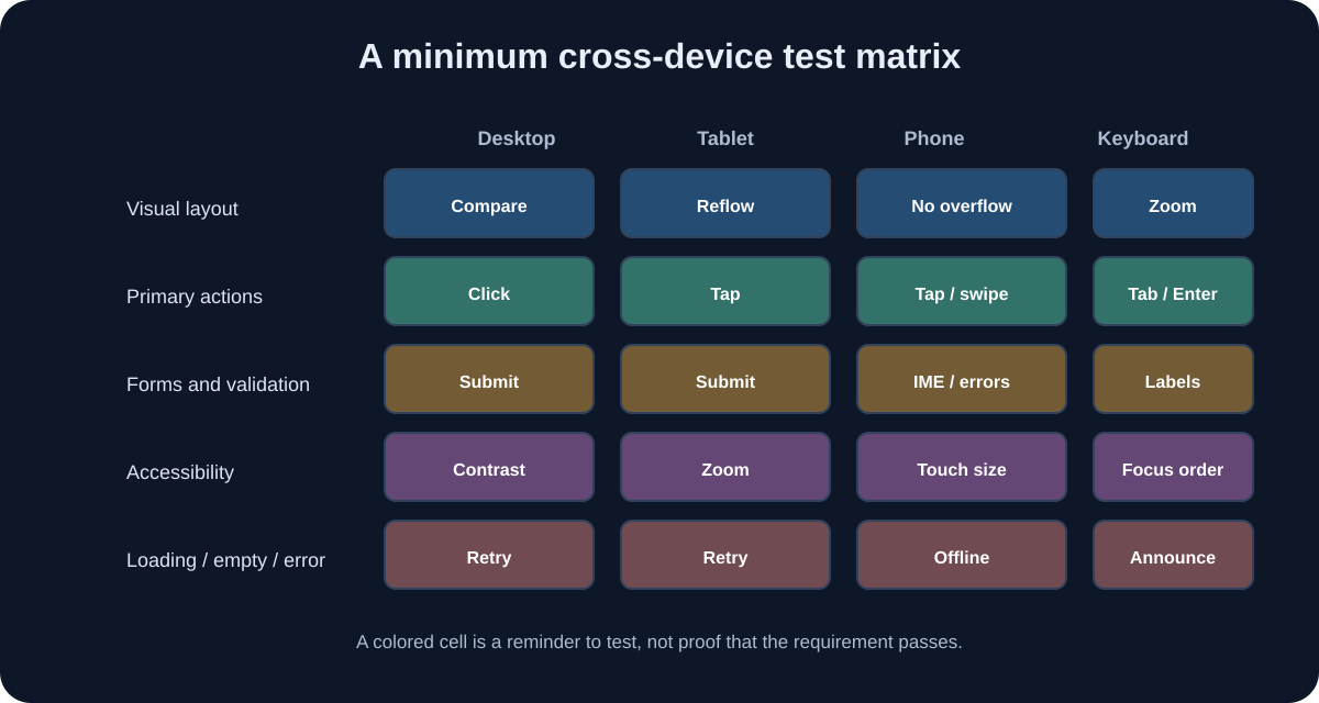
Start with functional tests: can the user search, select, add, favorite, clear, and recover from invalid input? Use unit tests for pure logic such as filtering and validation. Use component tests for labels and state transitions. Use browser automation for high-value journeys if the project already supports it. Avoid adding a large testing framework for a one-screen sketch unless your project needs it.
Then compare visual output at a matched viewport. Capture the authorized reference and the prototype under equivalent conditions. A pixel-diff tool can show mismatched regions, but anti-aliasing, dynamic text, and device scale can create noise. Use image differences to find areas to inspect, not as the sole quality measure.
Test layout at multiple widths, browser zoom, and text scaling. Try long and short content. Check that no button overlaps a fixed bar, content is not clipped, and focus indicators remain visible. Test portrait and landscape on an actual device where possible. Emulation is useful but does not reproduce every touch, keyboard, safe-area, or font behavior.
Test accessibility with an automated scanner, keyboard, and screen reader. Check contrast with tools and in real context. Make sure focus order follows the visual and task order. Verify that opening and closing a panel does not strand focus or leave hidden controls reachable.
Test failure states and recovery. Disconnect the network if the app has network requests. Submit invalid data. Refresh during a save if persistence exists. Check console errors and failed requests. Review the production build, not only the development server. Keep a record of browser versions, viewport sizes, and test outcomes so a later model-generated change can be compared to a baseline.
Make Visual Iteration Measurable
“Make it look better” is a weak instruction because it can produce broad redesign rather than a controlled correction. Compare a small number of measurable properties:
- Container edges align within a few CSS pixels at the chosen viewport.
- The number of visible list rows is close to the design brief.
- Heading and body text wrap at similar places with the selected font.
- The selected state is recognizable without color alone.
- Primary action is visible without scrolling in the target state.
- At the narrow width, no essential control is clipped or unreachable.
These are acceptance criteria for this prototype, not universal thresholds. Set them before iteration and adjust to the design goal. If the interface uses a different font, exact line breaks may not be possible; prioritize readable hierarchy and consistent spacing.
Use an iteration log:
| Pass | Observation | Change requested | Result | Keep / revert |
|---|---|---|---|---|
| 1 | Detail panel starts too far right | Reduce list column maximum | Better at 1440; check tablet | Keep provisionally |
| 2 | Phone has two columns at 390 px | Switch to list-first mobile view | No horizontal overflow | Keep |
| 3 | Favorite state only changes color | Add text/accessible state | Keyboard test passes | Keep |
One change per pass makes cause and effect visible. If a new prompt asks the model to adjust twenty unrelated values, it becomes harder to know what improved or regressed. Commit each stable stage or use a patch you can revert. Keep a screenshot of the last passing state and run regression tests after visual changes.
Avoid tuning to the screenshot’s compression artifacts, image borders, or browser-rendered font anti-aliasing. The goal is a coherent system, not overfitting to pixels at the expense of responsive behavior.
Port the Design to a Native Mobile App Only When Needed
A responsive web interface can run on phones and desktops, but it does not become a native app simply because it fits a phone screen. Native development may be appropriate if the product needs platform navigation conventions, camera or location APIs, notifications, background work, deeper offline behavior, or app-store distribution. If the task is a prototype or internal tool, a responsive web app may be sufficient.
The screenshot-to-code README lists Ionic among its supported targets, but generated output still needs review and device testing. For React Native, use the React Native documentation and build a native UI from the same behavior contract and design tokens. Some visual primitives translate; browser CSS, DOM elements, and web navigation do not.
Separate shared product logic from platform rendering where it makes sense. You may share data types, validation rules, and domain functions, while implementing navigation, forms, gestures, and accessibility differently on each platform. Do not force one shared component abstraction if it makes both platforms awkward.
Plan for platform-specific details: status bars, safe areas, software keyboards, back gestures, text scaling, permission prompts, offline modes, and touch feedback. Test on physical iOS and Android devices or a documented emulator matrix. Different screen densities and font rendering can change layout. Verify in-app browser and external-link behavior if relevant.
Do not request device permissions in a demo unless a visible feature requires them. If location is optional, explain why it is needed, ask at the time of use, handle denial gracefully, and avoid collecting more than necessary. Do not imply that a prototype stores sensitive data securely without a threat model and implementation evidence.
For a native implementation, treat the responsive web build as a design reference—not an automatically portable codebase. Reuse only what is genuinely platform-neutral, then test the native result against native interaction patterns and accessibility expectations.
Package the Web Interface as a Desktop App When It Adds Value
“Desktop” can mean a responsive website shown in a wide browser, an installable PWA, or a packaged desktop program. Decide which one you are building. If PocketAtlas only needs a large-window experience, the responsive website may be enough. A desktop wrapper adds installation, updates, signing, permissions, and support obligations; it should solve a real user need rather than make a screenshot look more app-like.
If you do need a desktop program, Tauri is one option that can host a web front end inside a native application shell. Its current getting-started documentation describes using a web front end with native capabilities and explains platform prerequisites. Electron is another framework for desktop applications using web technologies. Review the current documentation, target platforms, maintenance status, packaging model, and security guidance before choosing. Neither wrapper transforms an unreviewed prototype into a secure desktop product automatically.
Build the ordinary responsive app first and confirm it works in a browser. Then create a separate branch, initialize the chosen shell using its official instructions, and load only the local application. Do not point the wrapper at a third-party commercial site and call the result a recreation. Keep native capabilities disabled until a specific feature requires them.
For a desktop wrapper, define a narrow boundary between the web view and operating-system features. A note-taking prototype may need a “save file” capability, but it does not need arbitrary shell access. Expose only specific, typed operations; validate input on the native side; and avoid building a generic command channel from JavaScript to the system. Review how the framework isolates web content and which origins may access native commands.
For Electron in particular, follow current official security recommendations for renderer isolation and preload/IPC boundaries; never enable broad Node.js access in untrusted page content. For Tauri, follow its current capability and permission model, and do not grant plugins access to files or processes by default. Framework APIs change, so use current official security documentation rather than a copied configuration snippet.
Desktop testing adds its own matrix: supported operating systems, window resizing, high-DPI display, keyboard shortcuts, external links, file dialogs if used, crash recovery, updates, code signing, and uninstall behavior. A narrow desktop window should still reflow gracefully. Verify that app data is stored where expected, explain how to remove it, and do not retain sensitive data without a clear product need.
Package only after the front end’s functional and accessibility checks pass. Build a test installer and verify it on a clean machine or virtual machine. Confirm the app cannot access resources beyond its declared scope. If distribution is only for an internal design review, label it as a prototype and restrict its audience; do not skip the same basic review because the artifact is not in an app store.
Decide Whether You Need a Progressive Web App
A progressive web app (PWA) may provide an installable web experience with an app-like launcher entry, depending on browser and operating-system support. It can be a practical middle ground when you want a web deployment and selected offline or install behavior. It is not a universal substitute for native APIs or app-store distribution.
Add PWA capabilities only after the core responsive application works. Define what should happen offline, how updates are delivered, what data is cached, and how the app communicates stale content. A service worker that caches every request can accidentally retain private data or serve an outdated interface. Cache strategy is a privacy and reliability decision, not just a checkbox.
If you add a web app manifest, use original icons and an accurate app name. Do not use another company’s name or logo to make the prototype look official. Test the install and update flow on the supported browsers, including first install, offline restart, and update available.
Avoid claiming “works offline” if only the shell loads while all useful actions fail. Document which screens and data are available offline and how conflicts resolve after reconnecting. If the app handles user-generated content, test storage quotas, data loss, and recovery.
The right question is not “Can AI package this as an app?” It is “Which user need requires installation, native capabilities, or offline use, and can we support that behavior reliably?”
Review Security and Privacy Before Connecting Real Services
Generated UI code can add network calls, packages, telemetry, or unsafe patterns. Review every dependency, script, and API endpoint before running it. Check for hard-coded secrets, permissive cross-origin rules, unsafe HTML rendering, unvalidated URLs, and logging that reveals personal data. Treat source code from an AI generator like any other unreviewed contribution.
Keep authorization on the server. A hidden button does not protect an API. Validate incoming data at trusted boundaries and enforce the user’s permissions on each request. Use secure session handling and approved authentication libraries rather than generated cryptography or home-built password storage.
For public deployment, use HTTPS, review security headers, update dependencies, and scan the production build. Do not copy a real product’s login flow or collect credentials to make a demo feel authentic. If the prototype does not authenticate users, state clearly that it is a local demonstration and do not request passwords.
Data minimization applies to prompts, screenshots, application storage, logs, analytics, and backups. Use fictional data where possible. Remove image metadata if it contains location or author details that should not be shared. Set a retention policy for the project and delete test data when it is no longer needed.
AI-generated output can contain known vulnerable patterns or newly introduced dependencies. For security reviews, examine the actual diff and run the project’s trusted checks. Do not ask a coding agent to validate its own safety and accept the answer as proof. Independent review matters most when the app handles money, health, identity, employment, private communication, or access to other systems.
Build a Better Prompt Without Treating It Like a Spell
A useful prompt has inputs, objective, constraints, acceptance tests, and a request for explanation. Keep it short enough that the model can follow it, but specific enough to prevent surprise work. For the next PocketAtlas stage:
Add search to the existing PocketAtlas list. Search only fictional place name and area, case-insensitively. Keep the current layout and do not change dependencies. Show “No places match” when zero results remain. The search field must have a visible label, work with keyboard input, and not send data over the network. Add or update a focused test for matching and empty results. Before editing, list the files you expect to change. After editing, report the test command and any assumptions.
This prompt is not a guarantee. Read the diff to confirm no API call or unrelated refactor slipped in. Run the test and manually try a query with no matches. If the implementation does not meet one acceptance criterion, point to that criterion and request a narrow correction.
Do not let the model choose product scope from an image. Provide an explicit functional brief and a “must not” list. Ask it to mark uncertainty rather than inventing backend behavior. If the model is unsure what a visible icon means, give the behavior or leave it decorative.
When a task spans many files, ask for a plan and a list of intended changes before allowing edits. Keep the approved work bounded. If the tool supports automatic shell execution, review each command and do not approve destructive or remote operations you do not understand.
Use an assistant to accelerate drafting and exploration; use tests, human review, and product requirements to decide whether the result is acceptable. Prompt quality helps, but the verification loop is what makes the work dependable.
A Full AI-Mode Session with Approval Checkpoints
Here is a longer session pattern that works with an editor agent or screenshot generator. The purpose is not to make the model more autonomous; it is to make each contribution smaller and easier to verify. Keep this sequence in a project note so another developer can reproduce the decisions.
Checkpoint A: establish the allowed inputs. Tell the assistant what the screenshot is, who owns it, and what it may be used for. State that it contains no personal data and that it may be processed by the configured provider—only if that is true. If you cannot make that statement confidently, stop and replace the screenshot with an original wireframe. Do not rely on the model to infer rights from an image.
Checkpoint B: ask for an observation report, not code. Request a list of visible regions, alignment relationships, colors, typography clues, and controls. Require separate headings for “observed” and “uncertain.” Review the report against your own notes. Correct any model claim that is not visible. This step helps catch the common failure where a model confidently invents a sidebar behavior or assumes a logo is a button.
Checkpoint C: approve a component plan. Ask for the smallest component tree and file list that can render one state. Decline framework changes or new libraries unless they have a clear reason. Make sure the structure uses semantic elements and keeps example data separate. Approve only the parts that fit the scope.
Checkpoint D: generate a static screen. Ask the model to implement the desktop list with local fictional data and no network calls. Run the app and inspect the diff. Check that it has no hidden external URLs, telemetry, image hotlinks, or secret values. Capture a new screenshot at the same width as the reference.
Checkpoint E: compare and choose one correction. If the main content starts too low, ask only to adjust the top spacing. If the list is too wide, adjust the relevant column rule. Avoid combining an unrelated color rewrite, icon change, and state refactor into one prompt. Re-run at least a narrow viewport after each shared-style edit.
Checkpoint F: add one interaction. Select one behavior, such as choosing a place. Describe input, state transition, and visible result; ask for a test. Run the test and repeat with keyboard activation. Then move to search, favorites, form validation, and responsive navigation.
Checkpoint G: test before accepting the result. Ask the assistant to summarize implemented criteria and known limitations, but verify them independently. Review accessibility, security, privacy, and cross-device behavior. Keep the last passing state in Git.
A good follow-up prompt includes the evidence:
At 390 CSS px, the page still has a horizontal scrollbar. The detail column has a 24rem minimum width in
src/styles.css. Preserve the desktop layout. Change only the narrow-screen behavior so the list and detail do not sit side by side below the content breakpoint. Add a test or a reproducible manual check. Do not hide the detail permanently; provide a usable way to open it and return to the list. Report the changed files.
This prompt gives the model an observed defect, a likely cause, constraints, a required user path, and a request for evidence. It does not ask for a speculative redesign. If the proposed fix hides content or changes desktop behavior, reject it and clarify the acceptance criteria.
Use checkpoints for human approval, not just status messages. An agent saying “all tests pass” is not the same as reading the test output. An agent saying “no secrets found” is not the same as checking the diff and build artifacts. You own the decision to merge, share, or deploy.
Troubleshoot Common Failures
The output looks unlike the screenshot. Check viewport dimensions, zoom, font availability, container width, and whether the source image was scaled. Ask for one visible discrepancy at a time. Provide measurements and alignment notes instead of repeating “make it closer.”
It matches on desktop but breaks on a phone. Inspect fixed widths, min-width, absolute positioning, long text, and overflow. Decide how columns should reflow, then test the breakpoint around the actual content failure. Do not hide important features just to avoid layout work.
The app is attractive but buttons do nothing. Return to the interaction contract. Name each control, action, next state, and failure case. Implement one transition and add a test. Remove decorative controls that would otherwise mislead a user.
The model keeps changing unrelated files. Restore a clean checkpoint, narrow the prompt to named files and desired behavior, and ask for a proposed diff first. Avoid giving an agent broad access to a repository it does not need.
The generator wants a secret or provider key. Confirm that you are using the intended project and follow its current secret-storage instructions. Do not put a key into front-end source or a public repository. If you cannot store it safely, use a different workflow.
Generated code uses many new packages. Ask for the purpose of each package and whether a native API or existing project dependency can do the job. Review package names and maintainers carefully. Remove unnecessary additions and update the lockfile intentionally.
The screenshot comparison is noisy. Match the viewport and scale, use stable sample content, and ignore anti-aliasing differences until layout is correct. Compare components and key alignment points, not only a whole-page pixel score.
A photo or screenshot upload is blocked by policy. Do not try another account or tool to evade the restriction. Create an original mockup, use a licensed public design asset, or proceed from a written description that does not contain restricted material.
The page has no errors but still feels wrong. Ask a person unfamiliar with the design to complete the intended task. Observe where they hesitate. A clean console and a close screenshot do not prove that the navigation, wording, or information hierarchy is understandable.
A Worked PocketAtlas Plan from Start to Finish
Here is a practical order for the whole exercise. It is deliberately staged so that each step leaves behind something you can inspect:
- Write the scope. PocketAtlas is a local prototype with fictional place records. Define what it does and does not do.
- Confirm rights. Use an original mockup or a design you own. Note that the file can be sent to the selected AI provider.
- Define the acceptance criteria. List states, actions, widths, and accessibility expectations.
- Create a clean Git repository. Record the runtime and tool versions. Add environment files and private screenshots to
.gitignore. - Start the generator. Follow its current documentation. Verify local access and API-key configuration.
- Build the static desktop frame. Ask for semantic React components with sample records and no extra packages.
- Compare at the same viewport. Fix content width, columns, alignment, typography, and spacing.
- Implement list selection. Use a stable record ID and verify the detail panel updates.
- Add search. Test matching, empty results, clear behavior, keyboard input, and accessible label.
- Add the form. Validate required fields, preserve values on error, and show success only after actual state changes.
- Reflow for mobile. Choose list-first navigation and a detail view that is reachable and reversible.
- Add empty and error states. Do not leave the user staring at a blank screen or false success.
- Run automated checks. Use existing lint, type, and test commands; inspect all changes.
- Test keyboard and assistive tech. Check focus, names, labels, announcements, and zoom.
- Review privacy and packages. Confirm no secrets or real data were added.
- Build and preview production. Check final static or production output, not only hot reload.
- Document limits. Say that data is local and temporary if that is true; identify unsupported screens and states.
If the output drifts, return to the last passing commit and repeat a single step. If a product behavior is undecided, stop generation and decide it first. This avoids letting generated code become the de facto product specification.
Make a Small Validation Plan You Can Repeat
Save a short test plan in the project:
Environment: Chrome + Firefox, current stable
Widths: 320, 390, 768, 1024, 1440 CSS px
Task: search for Cedar, open details, favorite it, add a new place
Keyboard: Tab to search, type query, activate row, toggle favorite, submit form
Boundaries: blank title, long title, no results, narrow landscape, 200% zoom
Privacy: no real account, no external request, no secrets in repository
The values are a reasonable starter, not an exhaustive compatibility promise. Adjust browsers and devices based on your intended users. Test actual devices where touch, screen readers, native keyboards, or safe areas matter. Record the specific failure rather than “mobile broken.”
For every test, note expected and actual behavior. A defect report like “At 320 CSS px, selecting a place leaves the page horizontally scrollable because the detail panel retains a 24rem minimum width” gives a clear target. “AI made it bad” does not.
Run tests after changes to shared styles and state logic. A typography adjustment can push a control offscreen. A mobile navigation change can leave hidden elements in the tab order. A generated refactor can change key behavior. Re-run at least the affected part of the matrix after every meaningful iteration.
Keep an unedited copy of the authorized reference and generated screenshots only where the rights and retention policy allow it. If you cannot retain the reference, document measurements and test outcomes without storing the restricted image.
Understand the Limits of Screenshot Similarity
Visual similarity is only one quality dimension. A good prototype also needs coherent behavior, responsive layout, accessible structure, understandable content, maintainable code, and appropriate data handling. Some of these dimensions trade off: a narrow screenshot can reward fixed pixel widths that make the app unusable on another phone; exact wording may conflict with licensing; a visually matching icon may be inaccessible if it has no name.
There is no universal percentage score that proves a successful reconstruction. A pixel-diff value depends on image scaling, font rasterization, anti-aliasing, and capture tools. If you use a visual regression threshold, calibrate it to your environment and inspect large changed regions manually. Do not advertise a numeric accuracy claim without a reproducible method and evidence.
A useful review is a layered one:
- Structure: Are the major regions and content hierarchy correct?
- Visual system: Are spacing, typography, color, borders, and alignment coherent?
- Behavior: Do controls perform the intended action and handle failure?
- Adaptation: Does the layout work at the widths and text sizes users need?
- Access: Can people use it with keyboard, screen readers, and other assistive technology?
- Engineering: Can another developer understand, test, and safely extend it?
- Rights and trust: Is the work authorized and clearly distinct where needed?
Use a short scorecard to reveal gaps, not to mask them:
| Dimension | Evidence to collect | Pass condition |
|---|---|---|
| Visual layout | Matched screenshots at agreed widths | Major alignments and hierarchy meet the brief |
| Core tasks | Manual or automated journey test | Each required action has a correct visible result |
| Responsive behavior | Width and device checks | No clipped or unreachable essential content |
| Accessibility | Keyboard, scanner, assistive tech | No known blocking issue in tested flows |
| Reliability | Errors and network behavior | Failures are explicit and recoverable |
| Provenance | Permission and asset register | Inputs and outputs have a documented basis |
Do not average away a critical failure. A beautiful screen does not compensate for exposing an API key or collecting passwords without need. Prioritize by user harm and fix blocking issues before presenting the work as complete.
Prepare a Responsible Demo or Handoff
Before sharing the prototype, remove provider keys, private screenshots, local logs, and personal data from the package. Confirm that .env is untracked and that build output does not bundle secrets. If you used a hosted generator, understand what uploaded files remain in its account and delete them when the provider supports deletion and policy requires it.
Label the result accurately: “interactive front-end prototype using fictional data,” not “official clone” or “production-ready replacement.” If you used an existing app only as an authorized internal reference, do not publish its screenshots or branding publicly without permission. Make original naming and visual identity obvious when there could be confusion.
Provide a README with:
- The prototype’s intended purpose and audience.
- Framework and runtime versions.
- Setup and local run commands.
- What is mocked and what is real.
- Required environment variables without their values.
- The test commands and device/viewport coverage.
- Known limitations and unimplemented states.
- Source and license for included assets.
- Where reviewers can find the design brief and acceptance criteria.
For client work, document the source authorization and agreed deliverables in the approved project system rather than a public repository. Hand off code in the client’s preferred repository, with the permission and data policies of that organization. Do not include third-party AI prompts or screenshots if the contract or provider terms restrict them.
If the prototype will become a product, plan a separate production review. That review should cover authentication, authorization, threat modeling, privacy, retention, observability, accessibility, performance, support, deployment, and legal obligations. A generated demo is an experiment—not a substitute for those decisions.
A Practical Final Checklist
Use this before showing an AI-assisted reconstruction:
- The screenshot or mockup is mine, licensed, or explicitly authorized for this use.
- The capture contains no personal, customer, secret, or confidential information.
- The AI service’s current processing terms fit the data and project.
- The project scope states what the prototype does and does not do.
- The generated code and every dependency have been reviewed.
- API keys and private files are excluded from source control and builds.
- Desktop, tablet, and mobile layouts have been checked at defined widths.
- Main interactions, boundary cases, loading, empty, and error states work.
- Keyboard focus, labels, contrast, and screen-reader behavior have been reviewed.
- Images and icons have a verified source and license.
- The result is clearly identified as a prototype if it is not production-ready.
- A human has verified the intended user journey, not just the screenshot.
If any rights or data box is unclear, do not upload the image. If any functionality box is unchecked, describe the limitation before sharing. If the intended task cannot be completed without copying a protected identity or bypassing a control, change the project brief instead.
Common Questions
Can I use this process to recreate my own old app?
Yes, if you own or are authorized to use the screenshots and related assets. A clean-room rebuild from screenshots is useful when the original code is lost, but screenshots will not restore hidden behavior or data. Write down the intended behavior from product documentation or user interviews, and mark inferred details.
Can I use a competitor app as a design reference?
Do not assume you may copy it. Public visibility does not settle copyright, trademark, contract, or terms-of-service issues. You can research broad usability patterns and create your own expression, but avoid copying distinctive graphics, text, names, and branding. Get qualified advice if the project is commercial or the boundary is unclear.
Does screenshot-to-code need an API key?
The current GitHub project README says local generation requires at least one model-provider key. Its hosted option may have different account and billing requirements. Check the live README and service terms; never commit keys or paste them into client-side source.
Can I generate both iOS and Android interfaces from one screenshot?
A model may draft cross-platform code, but one screenshot cannot specify all platform behavior. Create a shared requirements and design-token layer, then implement and test platform-specific navigation, controls, keyboard behavior, permissions, and accessibility. Validate on the devices you plan to support.
Is the generated code safe to publish?
Not automatically. Review licensing, dependencies, network requests, secrets, privacy, security, accessibility, and tests. Remove anything you cannot explain. Use a production review appropriate to the data and users before launch.
What if the generator produces a close copy of a brand?
Stop and change the inputs and prompt. Remove logos, protected text, and distinctive assets; replace them with original visual choices. Do not publish a confusingly similar product. When uncertain, consult a qualified professional.
How should I compare the result with the screenshot?
Use matching viewport dimensions, browser zoom, content, and scale. Compare major layout and typography first, then details. Pixel-diff tooling can highlight areas but is sensitive to fonts and rendering. Also test interaction, responsiveness, keyboard use, screen readers, and failure states.
Can I use it to copy a native app’s private API?
This guide is about authorized UI prototyping. It does not instruct you to bypass access controls, inspect private traffic, extract credentials, or reproduce a service’s backend. Use documented APIs and authorized test environments; obtain permission before integration work.
Conclusion: Reconstruct Responsibly, Then Prove the Result
AI has lowered the effort required to turn a visual reference into a first draft. It has not removed the need for authorization, engineering judgment, product decisions, or testing. The reliable workflow is straightforward: confirm rights, remove sensitive data, record what is known and unknown, generate a small implementation, inspect every change, and test across states and screen sizes.
Use screenshot-to-code as one tool to evaluate—not as an authority or a substitute for a developer. Read its current setup and license information, keep keys private, and check what data leaves your machine. Make responsive web and native app decisions separately. Most importantly, do not confuse visible resemblance with permission, behavior, accessibility, or production readiness.
The most valuable output is not a screenshot that looks convincing. It is a prototype whose scope is honest, whose behavior is testable, whose assets are properly sourced, and whose code a responsible team can understand and improve.